HANCOCK WHITNEY BANK
The southeastern bank asked 352’s UX team to reimagine and redesign their marketing site to help them compete against national players and attract the Millennial & Gen X demographic as their customer base skewed largely toward baby boomers.
THINGS I DID:
(A) Stakeholder Interviews / User Research (B) Competitive Analysis (C) UX Design & Prototyping
STAKEHOLDER INTERVIEWS & USER RESEARCH
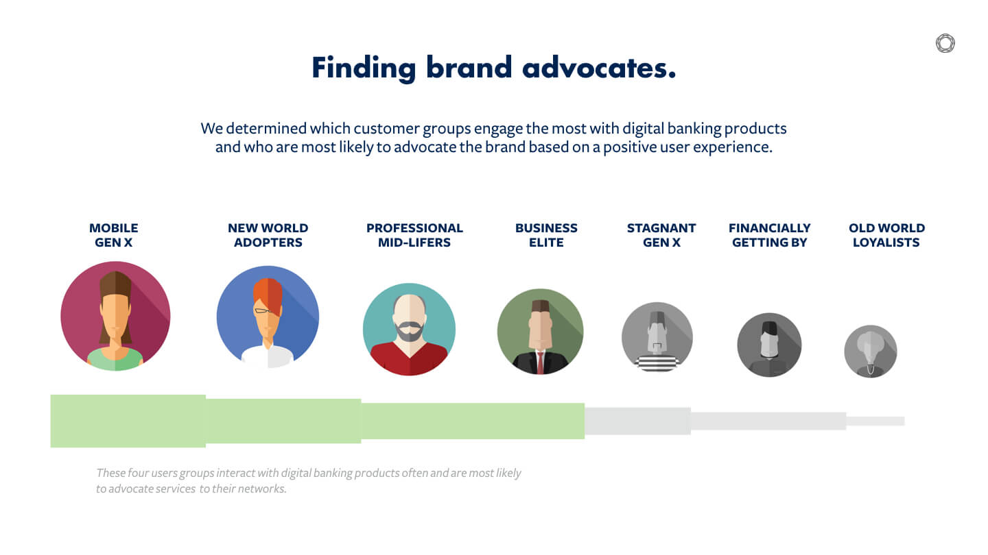
I participated in CEO-level stakeholder interviews to (1) understand the bank's business goals for attracting a younger market, (2) to establish user-personas, and (3) to determine what features would cause higher acquisition and advocation.
COMPETITIVE ANALYSES
I completed a competitive analysis of the bank's top competitors and discovered trends where the bank could capitalize upon and outshine their rivals.
Of competitors provided products/services information on their mobile experience.
Of competitors had a fully-responsive website.
Of competitors had consistent branding or user interface across their site.
WIREFRAMING & PROTOTYPING
Based on the bank's key business objectives and competitive analysis, I created wireframes and a Keynote prototype.
Example Wireframes


